Component library · 8 designs
Power BI page navigation and buttons
Power BI has three native ways to move around a report: the page navigator (one button per page, kept in sync with the report), the bookmark navigator (one button per bookmark in a group) and buttons with an action such as Back or Clear all slicers.
These designs place those visuals for you and style them in the brand kit. In the PBIP or page-folder download each one is a real visual container, not a picture of a button: the page navigator lists your pages as soon as the page is in a report.
By Nawaf Sharaf · Founder & Reliability Engineer · Updated
Free for commercial useTop page tabs
A full-width page navigator under the header. Power BI fills it with the report's pages and keeps it in sync when pages are added, renamed or hidden.

Native Power BI visuals: Page navigator.
Positions on a 1280 × 720 page
Visual X Y Width Height Pages (Page navigator) 24 104 640 40 Left navigation rail
A surface-coloured rail down the left edge with the logo on top and a vertical page navigator below. Suits reports with five or more pages, where tabs would wrap.
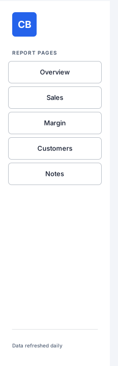
Native Power BI visuals: Page navigator.
Positions on a 1280 × 720 page
Visual X Y Width Height Pages (Page navigator) 16 120 184 288 Compact icon rail
A narrow rail with one icon per page next to a slim vertical page navigator. Gives the page back most of its width; label the icons so the rail still reads without colour.

Native Power BI visuals: Page navigator.
Positions on a 1280 × 720 page
Visual X Y Width Height Pages (Page navigator) 48 96 96 184 Chart / table toggle
A two-button bookmark navigator in the corner of a panel that swaps between a chart and a table of the same numbers. Create the two bookmarks in Desktop and put them in one group.
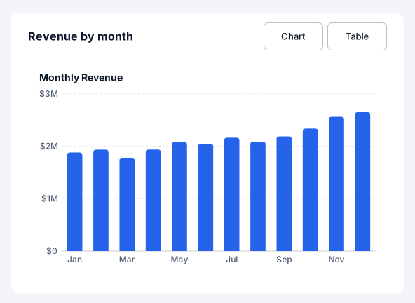
Native Power BI visuals: Bookmark navigator, Column chart.
Positions on a 1280 × 720 page
Visual X Y Width Height Views (Bookmark navigator) 720 176 176 40 Monthly Revenue (Column chart) 384 232 512 304 Scenario switcher
A horizontal bookmark navigator for Actual, Budget and Forecast views of the same page, with a caption that says what changes. One click per scenario instead of a slicer.

Native Power BI visuals: Bookmark navigator.
Positions on a 1280 × 720 page
Visual X Y Width Height Scenarios (Bookmark navigator) 24 136 360 40 Drill-through back button
The Back button Power BI expects on a drill-through page, styled in the brand, with the page's purpose next to it. Ctrl+click it in Desktop; it works on a click in the service.

Native Power BI visuals: Button.
Positions on a 1280 × 720 page
Visual X Y Width Height Back (Button) 24 24 112 40 Footer with page navigator
A footer bar with a Back button on the left and the page navigator on the right: navigation that stays out of the way of the content above it.

Native Power BI visuals: Button, Page navigator.
Positions on a 1280 × 720 page
Visual X Y Width Height Back (Button) 24 668 104 40 Pages (Page navigator) 696 668 560 40 Clear and apply filter buttons
Two buttons that clear every slicer on the page or apply pending slicer changes at once. The apply button matters when slicers are set to wait for an Apply click.

Native Power BI visuals: Button × 2.
Positions on a 1280 × 720 page
Visual X Y Width Height Clear filters (Button) 24 120 136 40 Apply filters (Button) 176 120 136 40
Design rules for navigation
- Tabs up to five pages
More than five page names wrap or shrink on a 1280 px page; switch to a left rail.
- Bookmarks need a group
A bookmark navigator shows the bookmarks of one group. Create the bookmarks in Desktop (View → Bookmarks), group them, then pick the group in the navigator's format pane.
- Back on every drill-through page
Readers who land on a drill-through page need a visible way out; Power BI adds one by default, so keep and style it.
Add a component to your report
- 1
Pick a theme and download
Choose a theme above (or open the component in the Design Studio to use your own brand kit), then download the page folder (.zip).
- 2
Save your report as a .pbip
In Power BI Desktop, File → Save as → Power BI project (.pbip) with the PBIR format, then close Desktop.
- 3
Copy the page folder in
Copy definition/pages/<page> into <YourReport>.Report/definition/pages/, add the page name to pageOrder in pages.json, and register the background PNG in report.json. INSTRUCTIONS.md in the zip has the exact JSON.
- 4
Reopen and connect fields
Reopen the .pbip. The background and every native visual are placed; drag your fields onto slicers and charts, set button actions that need a target (a page or bookmark) and create bookmarks for bookmark navigators.
Frequently asked questions
Are these navigation images or real Power BI visuals?
Both, split the way Power BI works: shapes, text and icons go into the page background image; slicers, page navigators, bookmark navigators, buttons and chart placeholders are real visual containers in the PBIR page folder. 8 of the 8 designs on this page include native visuals.
Do they use my brand colours?
Yes. Every component is drawn from the brand kit's colour roles (page, surface, text, muted, accent, status and data colours) and fonts. Pick a theme here, or open a component in the Design Studio and set your colours, fonts and logo in the Brand panel before exporting.
Can I add one to a page I already designed?
Yes. In the Design Studio, open Insert → Components and click a component: it is drawn in your design's brand and placed where it belongs on the page (a header at the top, a footer at the bottom), scaled to your page size.
Which Power BI Desktop version do I need?
The page folder uses the PBIR report format, the default report format from the September 2026 Power BI Desktop release; older reports can be saved as PBIR with File → Save as → Power BI project. The page-folder export is in beta until we finish checking it in Desktop.