Free component library
Power BI report components
 Headers8 designs · Accent bar with date filter, Minimal title with rule, Title with KPI strip…
 Navigation8 designs · Top page tabs, Left navigation rail, Compact icon rail…
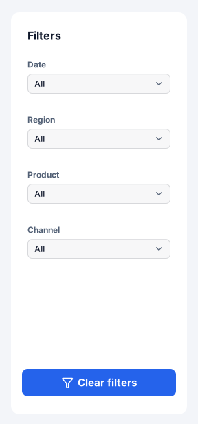 Slicer patterns8 designs · Left filter pane, Filter bar under the header, Button slicer chips…
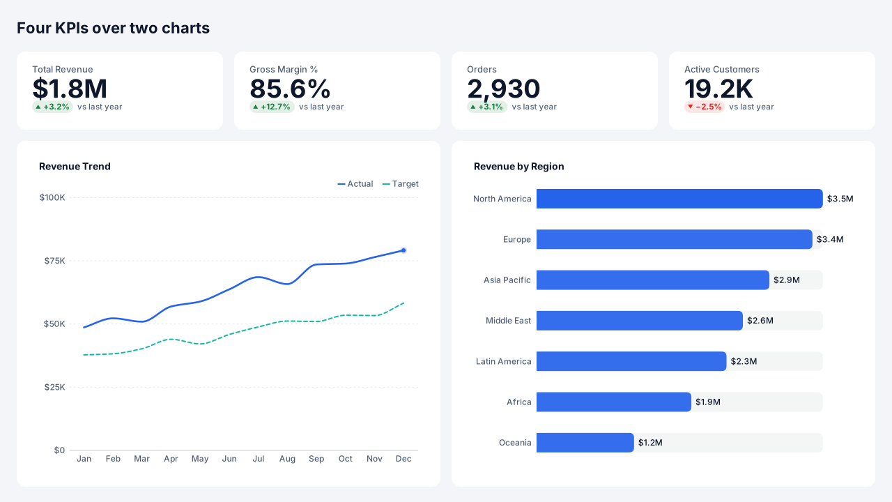 Page grids8 designs · Four KPIs over two charts, Hero chart with side stack, Z-pattern page…
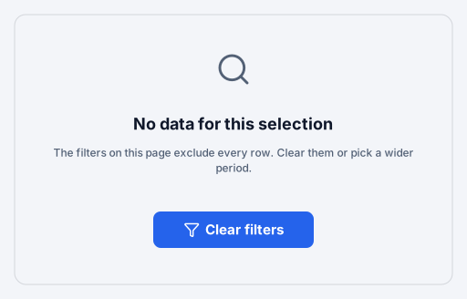 UX helpers8 designs · Empty state with reset, Info note on a KPI, Section divider…
How to use the components
- 1
Pick a family
Headers, navigation, slicer patterns, page grids or UX helpers. Each family page shows every design in the theme you choose.
- 2
Open or download
Open a component in the Design Studio to restyle it with your brand kit, or download its page folder (.zip) straight away.
- 3
Insert while designing
In the Design Studio, Insert → Components places any component on the page you are designing, in that page's brand.
Frequently asked questions
What is a component here?
A small, reusable part of a report page (a header, a navigation rail, a filter pane, a page grid, an empty state) designed once and drawn in any brand kit. Decoration goes into the page background image; slicers, navigators, buttons and chart placeholders export as real Power BI visual containers.
Are the navigators and buttons real Power BI visuals?
Yes. Page navigators, bookmark navigators, buttons and slicers export as Power BI's own visuals in the PBIR files, styled with the brand's colours and font. Settings that need something only your report has (a page or bookmark to jump to, a field for the Button slicer) are left for you to set in Desktop.
Are they free for client work?
Yes, like the rest of the design assets: see the licence page. Gallery downloads carry a small “Made with VizForge” mark; export from the Design Studio while signed in (free account) to remove it.