Aviation · Power BI template
Airline Operations & Fleet Reliability Power BI template
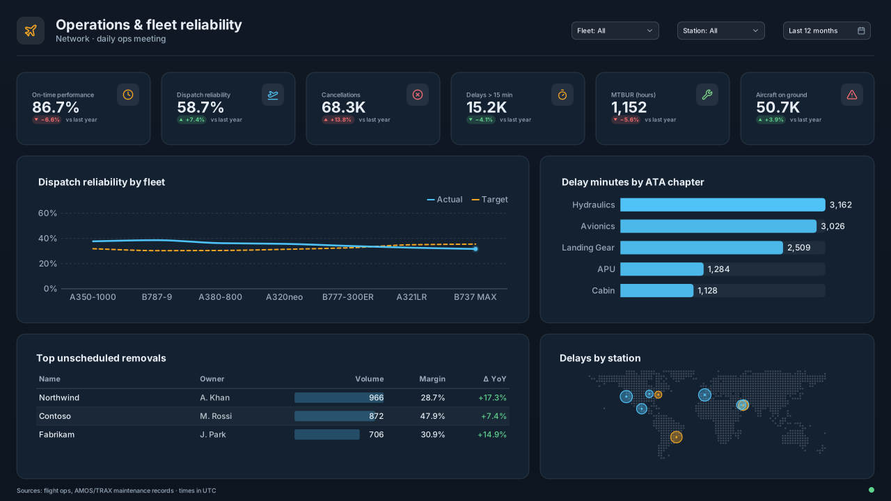
Power BI airline operations template: OTP, dispatch reliability, cancellations, delays and AOG KPIs, fleet reliability trend, ATA delay causes and stations.
By Nawaf Sharaf · Founder & Reliability Engineer · Updated
Free for commercial useLight version: same layout, colours re-solved and checked for WCAG AA contrast.
BetaOpens in Power BI Desktop with 8 tables of sample data and every visual bound. See what’s inside
Free, no sign-up. The PBIP with sample data includes the background, theme and a README. 1920×1080 fits a new page in a Fluent 2 report; 1280×720 and 2× fit Classic pages. Downloads carry a small “Made with VizForge” mark (sign in to the studio to remove it).
- Layout
- Plain header with 3 slicers, 6 KPIs, reliability trend + ATA bars, removals table + station map
- Page size
- 1280×720 px (16:9, Power BI default)
- Theme
- Aviation Ops
Open the sample-data PBIP in Power BI Desktop
Checked against Microsoft Learn's Power BI Desktop projects documentation (as of Nov 2026).
- 1
Unzip to a short path and open the .pbip
Extract the zip to a short local folder such as C:\PBI (Windows limits project paths to 260 characters, and Desktop can't save a project straight to OneDrive or SharePoint), then double-click the .pbip file or use File → Open in Power BI Desktop. Microsoft still lists projects and TMDL as preview features (as of Nov 2026): if Desktop won't open the project, go to File → Options and settings → Options → Preview features, tick “Power BI Project (.pbip) save option” and “Store semantic model using TMDL format”, then restart Desktop.
- 2
Select Refresh once
The project ships without the local data cache (.pbi/cache.abf), so Desktop opens the full model definition without data. Select Home → Refresh: every table is built from values written into its Power Query step, so there is no data source to sign in to.
- 3
Save as .pbix or connect your data
Use File → Save as to keep a single .pbix file, or open Transform data and replace each table's Source step with your own query, keeping the column names so the measures and visuals keep working.
What’s inside the Airline sample model
Rendered from the same definition the download writes as TMDL, so this list always matches the file.
A short-haul airline with 54 aircraft in three fleets over Nov 2025 to Oct 2026: monthly departures, delays and cancellations by fleet and station, technical delay minutes by ATA chapter, and a component removal log. Units: Flights and removals as counts; delay in minutes; flight hours.
Tables and columns
Calendar
Date table · 2025–2026, one row per dayDate table generated in Power Query (List.Dates), marked as the model's date table.
- Date (date)
- Year (whole number)
- Quarter (text)
- Month (text)
- Month Name (text)
- Week Start (date)
- Weekday (text)
- Fiscal Year (text)
Fleet
Dimension · 3 rowsFleets with aircraft count and aircraft on ground right now.
- Fleet (text)
- Aircraft (whole number)
- AOG Now (whole number)
Station
Dimension · 6 rowsDeparture stations (geocoded by city).
- Station (text)
- City (text)
- Country (text)
ATA Chapter
Dimension · 8 rowsATA 100 chapters used for technical delays and removals.
- Chapter (text)
- System (text)
- Chapter Label (text)
Part
Dimension · 8 rowsRotable part numbers.
- Part Number (text)
- Description (text)
Flights
Fact · 216 rowsMonthly departures and punctuality per fleet and departure station.
- Date (date)
- Fleet (text)
- Station (text)
- Departures (whole number)
- On Time (whole number)
- Delays Over 15 (whole number)
- Cancellations (whole number)
- Technical Interruptions (whole number)
- Flight Hours (decimal)
Tech Delays
Fact · 288 rowsTechnical delay minutes per fleet, ATA chapter and month.
- Date (date)
- Fleet (text)
- Chapter (text)
- Delay Minutes (whole number)
Removals
Fact · 72 rowsComponent removals; Unscheduled = 1 when the part was removed because of a failure.
- Date (date)
- Fleet (text)
- Part Number (text)
- Chapter (text)
- Unscheduled (whole number)
- Hours Since Install (whole number)
Relationships
Many-to-one, single direction. Inactive relationships are switched on inside a measure with USERELATIONSHIP.
- Flights[Date] → 'Calendar'[Date]
- Flights[Fleet] → Fleet[Fleet]
- Flights[Station] → Station[Station]
- 'Tech Delays'[Date] → 'Calendar'[Date]
- 'Tech Delays'[Fleet] → Fleet[Fleet]
- 'Tech Delays'[Chapter] → 'ATA Chapter'[Chapter]
- Removals[Date] → 'Calendar'[Date]
- Removals[Fleet] → Fleet[Fleet]
- Removals[Part Number] → Part[Part Number]
- Removals[Chapter] → 'ATA Chapter'[Chapter](inactive)
DAX measures
All measures live in a dedicated Key Measures table. Copy any of them into your own model; rename the table and column references to match.
DeparturesScheduled departures operated or cancelled.
Departures =
SUM ( Flights[Departures] )
Format string: #,0
On-Time PerformanceDeparted within 15 minutes of schedule.
On-Time Performance =
DIVIDE ( SUM ( Flights[On Time] ), [Departures] )
Format string: 0.0%
Dispatch ReliabilityDepartures without a technical delay over 15 minutes or a technical cancellation.
Dispatch Reliability =
1 - DIVIDE ( SUM ( Flights[Technical Interruptions] ), [Departures] )
Format string: 0.00%
CancellationsCancelled departures.
Cancellations =
SUM ( Flights[Cancellations] )
Format string: #,0
Delays Over 15 MinDepartures delayed more than 15 minutes.
Delays Over 15 Min =
SUM ( Flights[Delays Over 15] )
Format string: #,0
Aircraft on GroundAircraft grounded for a technical reason right now (snapshot).
Aircraft on Ground =
SUM ( Fleet[AOG Now] )
Format string: #,0
Tech Delay MinutesMinutes of technical delay.
Tech Delay Minutes =
SUM ( 'Tech Delays'[Delay Minutes] )
Format string: #,0
Unscheduled RemovalsRemovals caused by failures.
Unscheduled Removals =
SUM ( Removals[Unscheduled] )
Format string: #,0
MTBUR (hours)Mean time between unscheduled removals: fleet flight hours over unscheduled removals.
MTBUR (hours) =
DIVIDE (
    CALCULATE ( SUM ( Flights[Flight Hours] ), REMOVEFILTERS ( Station ) ),
    [Unscheduled Removals]
)
Format string: #,0
What each visual is bound to
The PBIP opens with these fields already on each visual.
| Visual | Type | Fields |
|---|---|---|
| FleetSlicer | Slicer | Fleet[Fleet] |
| StationSlicer | Slicer | Station[Station] |
| MonthSlicer | Slicer | Calendar[Month] |
| On-time performanceCard | Card | [On-Time Performance] |
| Dispatch reliabilityCard | Card | [Dispatch Reliability] |
| CancellationsCard | Card | [Cancellations] |
| Delays > 15 minCard | Card | [Delays Over 15 Min] |
| MTBUR (hours)Card | Card | [MTBUR (hours)] |
| Aircraft on groundCard | Card | [Aircraft on Ground] |
| Dispatch reliability by fleetLine chart | Line chart | Calendar[Month], [Dispatch Reliability], Fleet[Fleet] |
| Delay minutes by ATA chapterBar chart | Bar chart | 'ATA Chapter'[Chapter Label], [Tech Delay Minutes] |
| Top unscheduled removalsTable | Table | Part[Part Number], Part[Description], [Unscheduled Removals] |
| Delays by stationMap | Map | Station[City], [Delays Over 15 Min] |
Questions this dashboard answers
Each one is answered by a visual on the page, from the sample model's own tables and measures.
- Is on-time performance and dispatch reliability on target by fleet?
- Which ATA chapters cause the most delay minutes?
- Which components are removed unscheduled most often?
- Which stations generate the most delays?
About this dashboard layout
This page is built for the daily operations and reliability meeting at an airline or MRO. Six KPIs cover the operation (on-time performance, technical dispatch reliability, cancellations, delays over 15 minutes) and the fleet (mean time between unscheduled removals, aircraft on ground). Fleet, station and month slicers sit in the header.
Dispatch reliability by fleet over twelve months is the trend line engineering is judged on; draw the contractual or target reliability as a constant line. Beside it, delay minutes by ATA chapter as bars shows which aircraft systems cause the technical delays (ATA 21 air conditioning, 32 landing gear and 36 pneumatics are frequent offenders).
The bottom row lists the top unscheduled component removals (part number, ATA, removals, MTBUR) and maps delays by station, which separates aircraft problems from station problems: a delay hotspot at one outstation usually means spares or staffing, not the aircraft.
Aviation Ops uses cockpit display conventions (amber for caution, cyan for primary data, green for normal) so operations staff read the colours the way they already do on the flight deck. Keep red for AOG and cancellations only.
Visuals on the page
Positions are Power BI page pixels. Enter them in Format → General → Properties → Size and position, or use the PBIP download where they are already set.
| Visual | Type | X | Y | Width | Height |
|---|---|---|---|---|---|
| Fleet | Slicer | 816 | 24 | 136 | 40 |
| Station | Slicer | 968 | 24 | 136 | 40 |
| Month | Slicer | 1120 | 24 | 136 | 40 |
| On-time performance | Card | 40 | 120 | 120 | 72 |
| Dispatch reliability | Card | 248 | 120 | 120 | 72 |
| Cancellations | Card | 456 | 120 | 120 | 72 |
| Delays > 15 min | Card | 664 | 120 | 120 | 72 |
| MTBUR (hours) | Card | 872 | 120 | 120 | 72 |
| Aircraft on ground | Card | 1080 | 120 | 120 | 72 |
| Dispatch reliability by fleet | Line chart | 40 | 240 | 704 | 208 |
| Delay minutes by ATA chapter | Bar chart | 792 | 240 | 448 | 208 |
| Top unscheduled removals | Table | 40 | 496 | 704 | 176 |
| Delays by station | Map | 792 | 496 | 448 | 176 |
Custom visuals for this layout
Built-in Power BI visuals cover most slots above. These slots also suit a custom visual; each page covers the data shape, DAX and a prompt to generate it as a .pbiviz.
Slot: On-time performance
KPI CardExecutive dashboard KPI row (revenue, customers, NPS, churn)
Slot: Delay minutes by ATA chapter
Pareto ChartDefect category analysis (which defects cause 80% of complaints?)
Already have a report?
Brand Makeover tries Airline Operations & Fleet Reliability first on every page of your Power BI project (.pbip zip) where it fits: the page's visuals have to go into its 10 data slots without overlaps. Pages it can't seat get another catalog layout or a brand grid. Queries, filters and bookmarks are left as they are. Free, in your browser.
Opens with the Analyst / Dense preset, because the Executive preset doesn't use this layout (10 data slots; this preset uses templates with at most 7).
Restyle my report into thisSwap a slot for a custom visual
Pick any slot and VizForge AI writes a custom visual (.pbiviz, with TypeScript source) sized to it, in this template's colours and shaped for the fields it is bound to.
Generate one that fits this layout.
Card · 120×72 px · bound to [On-Time Performance]
1, 2 or 5 credits depending on the brief · 5 free on signup. Sign in or create a free account on the next screen; the brief is saved for 30 minutes.
A Power BI card visual titled "On-time performance". It sits in a 120×72 px slot on a designed report page. Match the report's brand: data colours #4FC3F7, #F5A623, #7BD389, #E57373, #BA68C8, #4DB6AC; background #142131; text #E8EEF5; font Segoe UI. Transparent visual background so the page design shows through; no visual border. In the sample model it is bound to [On-Time Performance]; keep the same data roles so the fields drop straight in.
Not sure what to build? Browse the visual catalog or open the template in the design studio and hand off any slot from there. Or start in the AI generator with a blank brief.
Colours and theme
Cockpit-slate dark Power BI theme with amber and cyan signals for airline operations, MRO, fleet reliability and logistics control-room dashboards.
Use the background in an existing report
Prefer to keep your own report? Apply the design to it instead of opening the PBIP.
- 1
Download the background
Take the 1920×1080 PNG for a new page in a Fluent 2 report (the default size for new pages), or the 2× PNG (2560×1440) for sharp text on a 1280×720 Classic page. Power BI scales the image to the canvas.
- 2
Set the canvas background
Format page → Canvas background → Browse. Set Image fit to Fill and transparency to 0%.
- 3
Import the theme
Design ribbon → Import theme (in the Power BI service: View → Theme pane), then pick the downloaded JSON. Data colours and fonts now match the design. Older Desktop builds: View → Themes → Browse for themes.
- 4
Place your visuals
Size each visual to the positions above with background and border off, or open the PBIP project where they are already placed.
Questions about this template
Does the Airline Operations & Fleet Reliability template come with sample data?
Yes. The “PBIP with sample data” download contains a semantic model with 8 tables and 9 DAX measures, and every visual on the page is already bound to it. The sample: A short-haul airline with 54 aircraft in three fleets over Nov 2025 to Oct 2026: monthly departures, delays and cancellations by fleet and station, technical delay minutes by ATA chapter, and a component removal log. The data is written into each table's Power Query step, so there is no data source or sign-in.
Is it a .pbix file?
It is a Power BI project (PBIP): a folder of text files that Power BI Desktop opens like a .pbix. Open the .pbip file, select Refresh once to load the sample rows, then use File → Save as if you want a single .pbix.
What visuals are in the Airline Operations & Fleet Reliability template?
The page has 13 visual areas: 3 slicers, 6 cards, 1 line chart, 1 bar chart, 1 table, 1 map. Their exact positions are listed on this page so you can match them in Power BI's Format → General → Properties panel, or skip that step by downloading the PBIP project.
Which theme does the Airline Operations & Fleet Reliability template use?
It ships with the Aviation Ops theme (dark tone). Download the theme JSON here, or open the template in the design studio and switch to any other theme or your own brand colours.
Is there a light version of the Airline Operations & Fleet Reliability template?
Yes. Switch the preview to Light and every download (background, theme JSON and PBIP) comes in that version. The layout is identical; the page, card and text colours are re-solved for a light page, and the accent, status and data colours keep their hues but are adjusted until text meets WCAG AA (4.5:1) and chart colours reach 3:1 against the cards.
How do I use the background image in Power BI Desktop?
Select the page, open Format page → Canvas background, choose Browse and pick the PNG, then set Image fit to Fill and transparency to 0%. Give your visuals a transparent background and no border so the designed panels show through.
Can I open the PBIP project in Power BI Desktop?
Yes. PBIR is the default report format in Power BI Desktop since September 2026, and the download is a PBIP project: unzip it and open the .pbip file, select Refresh once and the sample data loads into visuals that are already bound (the empty PBIP leaves the containers unbound for your own data). Microsoft still lists projects and TMDL as preview features (as of Nov 2026), so if Desktop won't open it, enable them under File → Options and settings → Options → Preview features.
Dashboard guides that use these visuals
Guides to the same dashboard job: which custom visuals it needs, the DAX behind them and prompts to generate them.
Dashboard job
Best Power BI Visuals for an Executive ScorecardThe best Power BI visuals for an executive scorecard — KPI cards, bullet grids, sparkline rows, SPC quality…
Dashboard job
Best Power BI Visuals for a Sales DashboardThe best Power BI visuals for a sales dashboard: pipeline funnel, KPI cards, bullet charts, territory…
Dashboard job
Best Power BI Visuals for Retail AnalyticsThe best Power BI visuals for retail analytics — store heatmaps, category Pareto, basket Sankeys, promotional…
Team
Power BI for financeVariance bridges, balance-sheet smalls, scenario sliders — the finance visuals Power BI's native waterfall and cards don't cover.
KPI cards for this layout
Headline numbers drawn by one DAX SVG measure each, for the Card visual or a table row.
Designs made for this template’s KPI slots: Fleet traffic light. Browse all styles in the KPI card gallery or build your own in the SVG measure builder.
Related templates
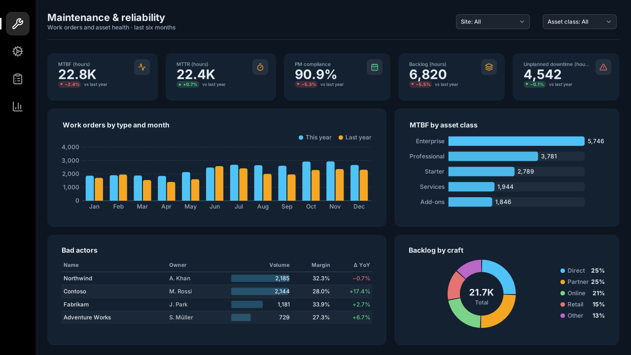
Maintenance & Asset Reliability
Manufacturing
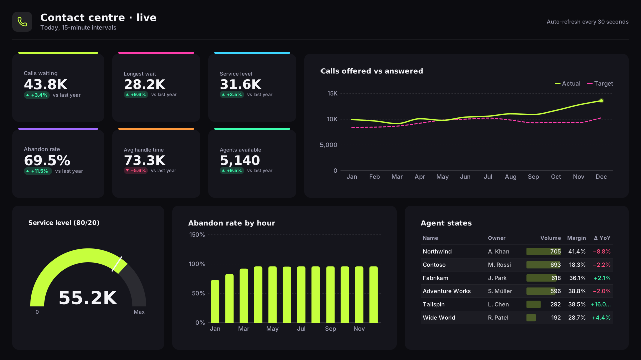
Call Centre Operations
Operations
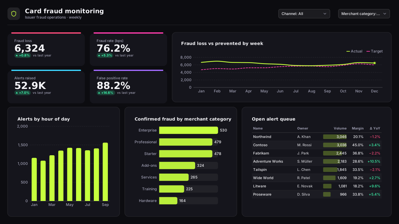
Card Fraud Monitoring
Banking
Keep exploring
61 hand-designed Power BI page layouts by department.
80 contrast-checked theme JSON files, light and dark.
Page backgrounds at 1280×720 and 1920×1080 with visual positions.
3,034 icons in 40 categories as SVG, PNG, DAX or theme icon JSON.
Make the Airline Operations & Fleet Reliability template yours
Swap in your brand colours and logo, move panels, add icons and generate missing visuals with AI, then export the background, theme JSON and PBIP project.
The design studio for Power BI. Free, in your browser, no sign-up.