Finance · Power BI template
Travel & Expense Management Power BI template
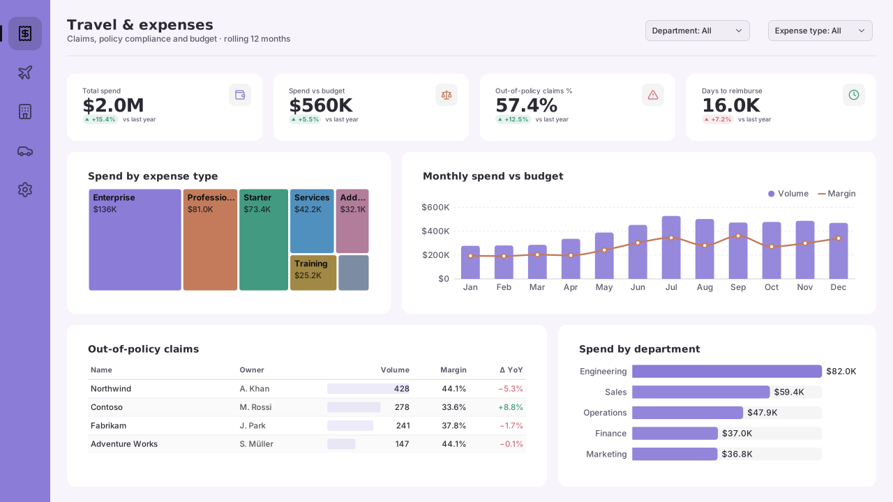
Power BI travel and expense (T&E) template: spend vs budget by month, spend by expense type, out-of-policy claims and days to reimburse.
By Nawaf Sharaf · Founder & Reliability Engineer · Updated
Free for commercial useDark version: same layout, colours re-solved and checked for WCAG AA contrast.
BetaOpens in Power BI Desktop with 5 tables of sample data and every visual bound. See what’s inside
Free, no sign-up. The PBIP with sample data includes the background, theme and a README. 1920×1080 fits a new page in a Fluent 2 report; 1280×720 and 2× fit Classic pages. Downloads carry a small “Made with VizForge” mark (sign in to the studio to remove it).
- Layout
- Left nav rail, 4 KPIs, expense-type treemap + spend vs budget combo, out-of-policy table + department bars
- Page size
- 1280×720 px (16:9, Power BI default)
- Theme
- Pastel Studio
Open the sample-data PBIP in Power BI Desktop
Checked against Microsoft Learn's Power BI Desktop projects documentation (as of Nov 2026).
- 1
Unzip to a short path and open the .pbip
Extract the zip to a short local folder such as C:\PBI (Windows limits project paths to 260 characters, and Desktop can't save a project straight to OneDrive or SharePoint), then double-click the .pbip file or use File → Open in Power BI Desktop. Microsoft still lists projects and TMDL as preview features (as of Nov 2026): if Desktop won't open the project, go to File → Options and settings → Options → Preview features, tick “Power BI Project (.pbip) save option” and “Store semantic model using TMDL format”, then restart Desktop.
- 2
Select Refresh once
The project ships without the local data cache (.pbi/cache.abf), so Desktop opens the full model definition without data. Select Home → Refresh: every table is built from values written into its Power Query step, so there is no data source to sign in to.
- 3
Save as .pbix or connect your data
Use File → Save as to keep a single .pbix file, or open Transform data and replace each table's Source step with your own query, keeping the column names so the measures and visuals keep working.
What’s inside the Travel & Expense sample model
Rendered from the same definition the download writes as TMDL, so this list always matches the file.
300 expense claims across five departments from November 2025 to October 2026, each checked against a per-claim policy cap, with days to reimburse and a monthly travel budget per department. Units: Euros; days.
Tables and columns
Calendar
Date table · 2025–2026, one row per dayDate table generated in Power Query (List.Dates), marked as the model's date table.
- Date (date)
- Year (whole number)
- Quarter (text)
- Month (text)
- Month Name (text)
- Week Start (date)
- Weekday (text)
- Fiscal Year (text)
Department
Dimension · 5 rowsDepartments with a travel budget.
- Department (text)
Expense Type
Dimension · 6 rowsExpense categories with the policy cap that applies to a single claim.
- Expense Type (text)
- Policy Cap (decimal)
Claims
Fact · 300 rowsOne row per expense claim line.
- Claim ID (text)
- Date (date)
- Employee (text)
- Department (text)
- Expense Type (text)
- Amount (decimal)
- Out of Policy (whole number)
- Days to Reimburse (whole number)
Travel Budget
Fact · 60 rowsMonthly travel and expense budget per department.
- Month (date)
- Department (text)
- Budget (decimal)
Relationships
Many-to-one, single direction. Inactive relationships are switched on inside a measure with USERELATIONSHIP.
- Claims[Date] → 'Calendar'[Date]
- Claims[Department] → Department[Department]
- Claims[Expense Type] → 'Expense Type'[Expense Type]
- 'Travel Budget'[Month] → 'Calendar'[Date]
- 'Travel Budget'[Department] → Department[Department]
DAX measures
All measures live in a dedicated Key Measures table. Copy any of them into your own model; rename the table and column references to match.
Total SpendClaimed amount.
Total Spend =
SUM ( Claims[Amount] )
Format string: €#,0
Claims SubmittedNumber of claim lines.
Claims Submitted =
COUNTROWS ( Claims )
Format string: #,0
Out-of-Policy SpendSpend on claims above the policy cap.
Out-of-Policy Spend =
CALCULATE ( [Total Spend], Claims[Out of Policy] = 1 )
Format string: €#,0
Out-of-Policy %Share of claims above the policy cap.
Out-of-Policy % =
DIVIDE ( CALCULATE ( [Claims Submitted], Claims[Out of Policy] = 1 ), [Claims Submitted] )
Format string: 0.0%
Avg Days to ReimburseAverage days from submission to payment.
Avg Days to Reimburse =
AVERAGE ( Claims[Days to Reimburse] )
Format string: 0.0
Travel BudgetBudgeted travel and expense spend.
Travel Budget =
SUM ( 'Travel Budget'[Budget] )
Format string: €#,0
Spend vs Budget %Spend as a share of budget.
Spend vs Budget % =
DIVIDE ( [Total Spend], [Travel Budget] )
Format string: 0%
What each visual is bound to
The PBIP opens with these fields already on each visual.
| Visual | Type | Fields |
|---|---|---|
| DepartmentSlicer | Slicer | Department[Department] |
| Expense typeSlicer | Slicer | 'Expense Type'[Expense Type] |
| Total spendCard | Card | [Total Spend] |
| Spend vs budgetCard | Card | [Spend vs Budget %] |
| Out-of-policy claims %Card | Card | [Out-of-Policy %] |
| Days to reimburseCard | Card | [Avg Days to Reimburse] |
| Spend by expense typeTreemap | Treemap | 'Expense Type'[Expense Type], [Total Spend] |
| Monthly spend vs budgetLine & column chart | Line & column chart | Calendar[Month], [Total Spend], [Travel Budget] |
| Out-of-policy claimsTable | Table | Claims[Claim ID], Claims[Employee], 'Expense Type'[Expense Type], [Out-of-Policy Spend] |
| Spend by departmentBar chart | Bar chart | Department[Department], [Total Spend], [Travel Budget] |
Questions this dashboard answers
Each one is answered by a visual on the page, from the sample model's own tables and measures.
- Is each department spending within its monthly travel budget?
- Which expense types make up most of the spend?
- Which claims broke policy, by whom and for how much?
- How long do employees wait to be reimbursed?
About this dashboard layout
Travel and expense reporting has two audiences that rarely share a page: budget holders, who care whether their department will overspend, and the finance controls team, who care which claims broke policy. This layout puts both on one page and lets the Department and Expense type slicers move between them.
The top row answers the budget question. A combo chart shows monthly spend as columns against the department travel budget as a line, and the treemap breaks the year's spend into air travel, hotels, rail, meals, car hire and mileage, so a quarter where hotels quietly outgrow flights is visible at a glance.
The bottom-left table only lists claims above the policy cap for their expense type: it is bound to an out-of-policy spend measure, and Power BI drops rows where every value is blank, so the table filters itself without a visual-level filter. The department bars compare spend with budget side by side.
Policy caps live on the Expense Type dimension rather than in DAX, so finance can change a cap in one place. Days to reimburse is a column on each claim; employees notice slow reimbursement long before anyone reads the average.
Visuals on the page
Positions are Power BI page pixels. Enter them in Format → General → Properties → Size and position, or use the PBIP download where they are already set.
| Visual | Type | X | Y | Width | Height |
|---|---|---|---|---|---|
| Department | Slicer | 920 | 24 | 160 | 40 |
| Expense type | Slicer | 1096 | 24 | 160 | 40 |
| Total spend | Card | 112 | 120 | 208 | 64 |
| Spend vs budget | Card | 408 | 120 | 208 | 64 |
| Out-of-policy claims % | Card | 704 | 120 | 208 | 64 |
| Days to reimburse | Card | 1000 | 120 | 200 | 64 |
| Spend by expense type | Treemap | 112 | 232 | 432 | 200 |
| Monthly spend vs budget | Line & column chart | 592 | 232 | 648 | 200 |
| Out-of-policy claims | Table | 112 | 480 | 656 | 200 |
| Spend by department | Bar chart | 816 | 480 | 424 | 200 |
Custom visuals for this layout
Built-in Power BI visuals cover most slots above. These slots also suit a custom visual; each page covers the data shape, DAX and a prompt to generate it as a .pbiviz.
Slot: Total spend
KPI CardExecutive dashboard KPI row (revenue, customers, NPS, churn)
Slot: Spend vs budget
Bullet ChartExecutive KPI scorecards (5-10 KPIs in a grid)
Slot: Spend by expense type
TreemapPortfolio composition (asset class → sector → position)
Already have a report?
Brand Makeover tries Travel & Expense Management first on every page of your Power BI project (.pbip zip) where it fits: the page's visuals have to go into its 8 data slots without overlaps. Pages it can't seat get another catalog layout or a brand grid. Queries, filters and bookmarks are left as they are. Free, in your browser.
Opens with the Analyst / Dense preset, because the Executive preset doesn't use this layout (8 data slots; this preset uses templates with at most 7).
Restyle my report into thisSwap a slot for a custom visual
Pick any slot and VizForge AI writes a custom visual (.pbiviz, with TypeScript source) sized to it, in this template's colours and shaped for the fields it is bound to.
Generate one that fits this layout.
Card · 208×64 px · bound to [Total Spend]
1, 2 or 5 credits depending on the brief · 5 free on signup. Sign in or create a free account on the next screen; the brief is saved for 30 minutes.
A Power BI card visual titled "Total spend". It sits in a 208×64 px slot on a designed report page. Match the report's brand: data colours #8B7CD8, #C37B5B, #429B81, #5090BE, #B17D9B, #A18844; background #FFFFFF; text #2B2A33; font Segoe UI. Transparent visual background so the page design shows through; no visual border. In the sample model it is bound to [Total Spend]; keep the same data roles so the fields drop straight in.
Not sure what to build? Browse the visual catalog or open the template in the design studio and hand off any slot from there. Or start in the AI generator with a blank brief.
Colours and theme
Soft pastel Power BI theme that still passes contrast: lilac, peach, mint and sky mid-tones on white, with charcoal text for marketing reports.
Use the background in an existing report
Prefer to keep your own report? Apply the design to it instead of opening the PBIP.
- 1
Download the background
Take the 1920×1080 PNG for a new page in a Fluent 2 report (the default size for new pages), or the 2× PNG (2560×1440) for sharp text on a 1280×720 Classic page. Power BI scales the image to the canvas.
- 2
Set the canvas background
Format page → Canvas background → Browse. Set Image fit to Fill and transparency to 0%.
- 3
Import the theme
Design ribbon → Import theme (in the Power BI service: View → Theme pane), then pick the downloaded JSON. Data colours and fonts now match the design. Older Desktop builds: View → Themes → Browse for themes.
- 4
Place your visuals
Size each visual to the positions above with background and border off, or open the PBIP project where they are already placed.
Questions about this template
Does the Travel & Expense Management template come with sample data?
Yes. The “PBIP with sample data” download contains a semantic model with 5 tables and 7 DAX measures, and every visual on the page is already bound to it. The sample: 300 expense claims across five departments from November 2025 to October 2026, each checked against a per-claim policy cap, with days to reimburse and a monthly travel budget per department. The data is written into each table's Power Query step, so there is no data source or sign-in.
Is it a .pbix file?
It is a Power BI project (PBIP): a folder of text files that Power BI Desktop opens like a .pbix. Open the .pbip file, select Refresh once to load the sample rows, then use File → Save as if you want a single .pbix.
What visuals are in the Travel & Expense Management template?
The page has 10 visual areas: 2 slicers, 4 cards, 1 treemap, 1 line & column chart, 1 table, 1 bar chart. Their exact positions are listed on this page so you can match them in Power BI's Format → General → Properties panel, or skip that step by downloading the PBIP project.
Which theme does the Travel & Expense Management template use?
It ships with the Pastel Studio theme (light tone). Download the theme JSON here, or open the template in the design studio and switch to any other theme or your own brand colours.
Is there a dark version of the Travel & Expense Management template?
Yes. Switch the preview to Dark and every download (background, theme JSON and PBIP) comes in that version. The layout is identical; the page, card and text colours are re-solved for a dark page, and the accent, status and data colours keep their hues but are adjusted until text meets WCAG AA (4.5:1) and chart colours reach 3:1 against the cards.
How do I use the background image in Power BI Desktop?
Select the page, open Format page → Canvas background, choose Browse and pick the PNG, then set Image fit to Fill and transparency to 0%. Give your visuals a transparent background and no border so the designed panels show through.
Can I open the PBIP project in Power BI Desktop?
Yes. PBIR is the default report format in Power BI Desktop since September 2026, and the download is a PBIP project: unzip it and open the .pbip file, select Refresh once and the sample data loads into visuals that are already bound (the empty PBIP leaves the containers unbound for your own data). Microsoft still lists projects and TMDL as preview features (as of Nov 2026), so if Desktop won't open it, enable them under File → Options and settings → Options → Preview features.
Build guides for this dashboard
Guides to the same dashboard job: which custom visuals it needs, the DAX behind them and prompts to generate them.
Dashboard job
Best Power BI Visuals for Financial ReportingThe best Power BI visuals for financial reporting — waterfall bridges, variance matrices, SPC control, bullet…
Team
Power BI for financeVariance bridges, balance-sheet smalls, scenario sliders — the finance visuals Power BI's native waterfall and cards don't cover.
KPI cards for this layout
Headline numbers drawn by one DAX SVG measure each, for the Card visual or a table row.
Want the headline numbers to look like cards rather than plain values? Browse the KPI card gallery or build your own in the SVG measure builder.
Related templates
Keep exploring
61 hand-designed Power BI page layouts by department.
80 contrast-checked theme JSON files, light and dark.
Page backgrounds at 1280×720 and 1920×1080 with visual positions.
3,034 icons in 40 categories as SVG, PNG, DAX or theme icon JSON.
Make the Travel & Expense Management template yours
Swap in your brand colours and logo, move panels, add icons and generate missing visuals with AI, then export the background, theme JSON and PBIP project.
The design studio for Power BI. Free, in your browser, no sign-up.